The Ariovis visual identity.
Ariovis brand assets: logo, colors, typography, patterns and usage rules. This page is the reference for any internal or partner visual production.
The logo
The Ariovis logo comes in two variants: the full logotype, with the Security meets Business signature, and the monogram alone.


'/%3e%3cpath%20d='M219.539%20220.086H0.431808V439.099L219.539%20220.086Z'%20fill='url(%23paint1_radial_156_1019)'/%3e%3cg%20style='mix-blend-mode:overlay'%20opacity='0.5'%3e%3cpath%20d='M219.539%20220.086H0.431808V329.593L219.539%20220.086Z'%20fill='white'/%3e%3c/g%3e%3cdefs%3e%3cradialGradient%20id='paint0_radial_156_1019'%20cx='0'%20cy='0'%20r='1'%20gradientUnits='userSpaceOnUse'%20gradientTransform='translate(219.194%20220.097)%20rotate(135)%20scale(309.783%20309.917)'%3e%3cstop%20stop-color='%23FF76B7'/%3e%3cstop%20offset='0.212813'%20stop-color='%23DE0F72'/%3e%3cstop%20offset='0.406685'%20stop-color='%239E0E40'/%3e%3cstop%20offset='0.774373'%20stop-color='%23FF9900'/%3e%3cstop%20offset='1'%20stop-color='%23FFFF00'/%3e%3c/radialGradient%3e%3cradialGradient%20id='paint1_radial_156_1019'%20cx='0'%20cy='0'%20r='1'%20gradientUnits='userSpaceOnUse'%20gradientTransform='translate(219.194%20220.097)%20rotate(135)%20scale(309.783%20309.917)'%3e%3cstop%20stop-color='%23FFFF00'/%3e%3cstop%20offset='0.225627'%20stop-color='%23FF9900'/%3e%3cstop%20offset='0.593315'%20stop-color='%239E0E40'/%3e%3cstop%20offset='0.787187'%20stop-color='%23DE0F72'/%3e%3cstop%20offset='1'%20stop-color='%23FF76B7'/%3e%3c/radialGradient%3e%3c/defs%3e%3c/svg%3e)
'%20fill-opacity='0.5'/%3e%3cg%20style='mix-blend-mode:overlay'%20opacity='0.5'%3e%3cpath%20d='M219.562%20220.984L437.562%20438.984L328.352%20220.984H219.562Z'%20fill='black'/%3e%3c/g%3e%3cpath%20d='M220%200.984375L439%20219.984H329.288L220%200.984375Z'%20fill='white'/%3e%3cpath%20d='M219.07%20220.086H0.138367V439.099L219.07%20220.086Z'%20fill='url(%23paint1_radial_156_1037)'/%3e%3cg%20style='mix-blend-mode:overlay'%20opacity='0.5'%3e%3cpath%20d='M219.109%20220.086H0.00212097V329.593L219.109%20220.086Z'%20fill='white'/%3e%3c/g%3e%3cdefs%3e%3clinearGradient%20id='paint0_linear_156_1037'%20x1='328.533'%20y1='110.992'%20x2='218.979'%20y2='220.093'%20gradientUnits='userSpaceOnUse'%3e%3cstop%20stop-color='%23FFFF00'%20stop-opacity='0'/%3e%3cstop%20offset='1'%20stop-color='%23FF9900'/%3e%3c/linearGradient%3e%3cradialGradient%20id='paint1_radial_156_1037'%20cx='0'%20cy='0'%20r='1'%20gradientUnits='userSpaceOnUse'%20gradientTransform='translate(218.725%20220.097)%20rotate(134.977)%20scale(309.659%20309.793)'%3e%3cstop%20stop-color='%23FFFF00'/%3e%3cstop%20offset='0.225627'%20stop-color='%23FF9900'/%3e%3cstop%20offset='0.593315'%20stop-color='%239E0E40'/%3e%3cstop%20offset='0.787187'%20stop-color='%23DE0F72'/%3e%3cstop%20offset='1'%20stop-color='%23FF76B7'/%3e%3c/radialGradient%3e%3c/defs%3e%3c/svg%3e)
Usage rules
- Always use the official files. Never redraw or recompose the logo.
- Pick the variant matching the background: dark version on light backgrounds, light version on dark backgrounds.
- Keep clear space around the logo, at least equal to the monogram height.
- Do not stretch, tilt or alter the proportions.
- Do not change the colors, and do not add shadow, outline or any effect.
- Do not place the logo over an image or pattern that harms its readability.
- Minimum display width: 120 px for the logotype, 32 px for the monogram.
The Ariovis gradient
The gradient is Ariovis' visual signature. It is derived from the logo and appears across every medium.
| Color | Hex | Position | |
|---|---|---|---|
Yellow | #FFFF00 | 0% | |
Orange | #FF9900 | 22.56% | |
Bordeaux | #9E0E40 | 59.33% | |
Fuchsia | #DE0F72 | 78.72% | |
Pink | #FF76B7 | 100% |
background: linear-gradient(90deg, #FFFF00 0%, #FF9900 22.56%, #9E0E40 59.33%, #DE0F72 78.72%, #FF76B7 100%);
Usage rules
- The gradient is a signature, not a texture.
- Use it as a thin rule or on a small surface.
- Never use it as a button background, on text, or as a large flat fill.
- No more than three gradient elements on a single page.
- Do not animate it.
The palette
Neutrals
Primary accent
Orange #FF9900. Used for primary CTAs, always with dark text #0F172A.
Brand accents
Illustration colors
Contrast
| Background | Text | Ratio | Usage | |
|---|---|---|---|---|
| #FF9900 | #0F172A | 8.3:1 | Primary button | Aa |
| #FFFFFF | #9E0E40 | 8.1:1 | Editorial link, light theme | Aa |
| #020617 | #FF76B7 | 7.4:1 | Editorial link, dark theme | Aa |
| #DE0F72 | #FFFFFF | 4.8:1 | Badge | Aa |
| #FFFF00 | #0F172A | 16.6:1 | Illustration | Aa |
Never use white text on Orange, Yellow or Pink. The contrast drops to 2.1:1, 1.1:1 and 2.5:1 respectively.
Bai Jamjuree
Bai Jamjuree is Ariovis' single typeface. It is self-hosted, no request is sent to an external service.
Weights
- 400 · RegularIdentity and access security
- 500 · MediumIdentity and access security
- 600 · SemiBoldIdentity and access security
- 700 · BoldIdentity and access security
Typographic scale
- .t-displayHero titlesSecurity meets Business
- .t-h1Page main headingPage title
- .t-h2Section titleSection title
- .t-h3Sub-sectionSub-section
- .t-h4Card titleCard title
- .t-leadIntro below a headingIntroduction that supports a section title.
- .t-bodyBody copyBody copy, readable across long paragraphs.
- .t-smallMetadata, captionsMetadata and short captions.
- .t-captionLabels, intro rulesSection label
Rules
- Bai Jamjuree is the site's only typeface.
- Do not use DM Sans or Inter.
- Do not mix multiple families.
- No more than three sizes in a single layout.
- Left-aligned by default.
Patterns
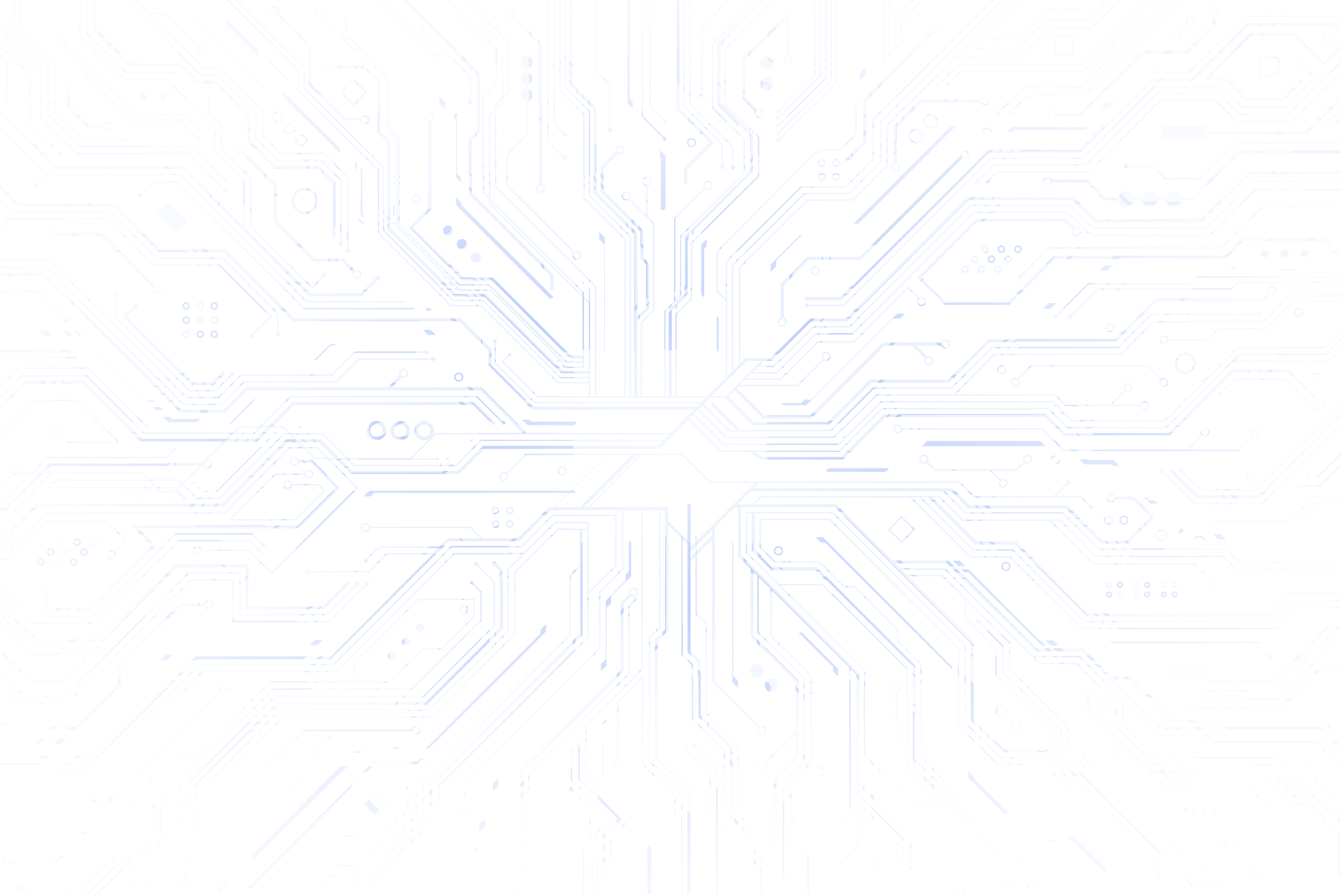
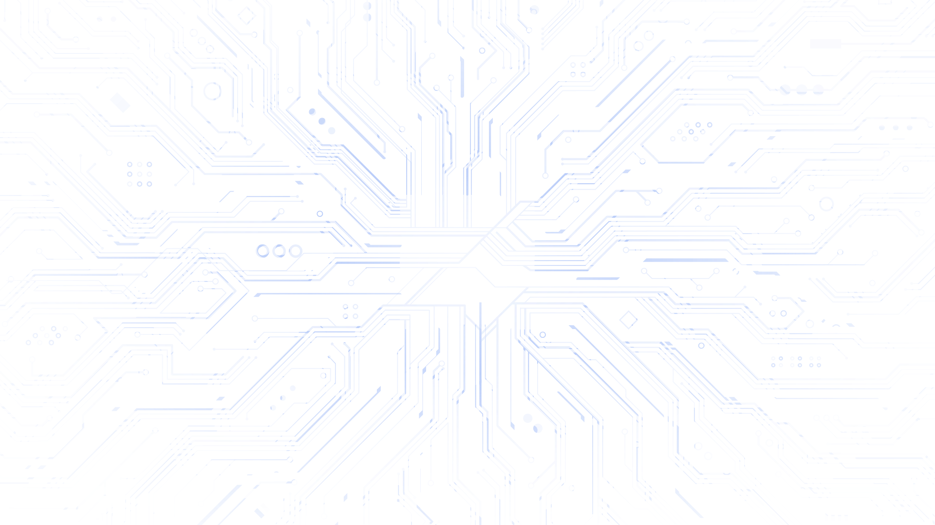
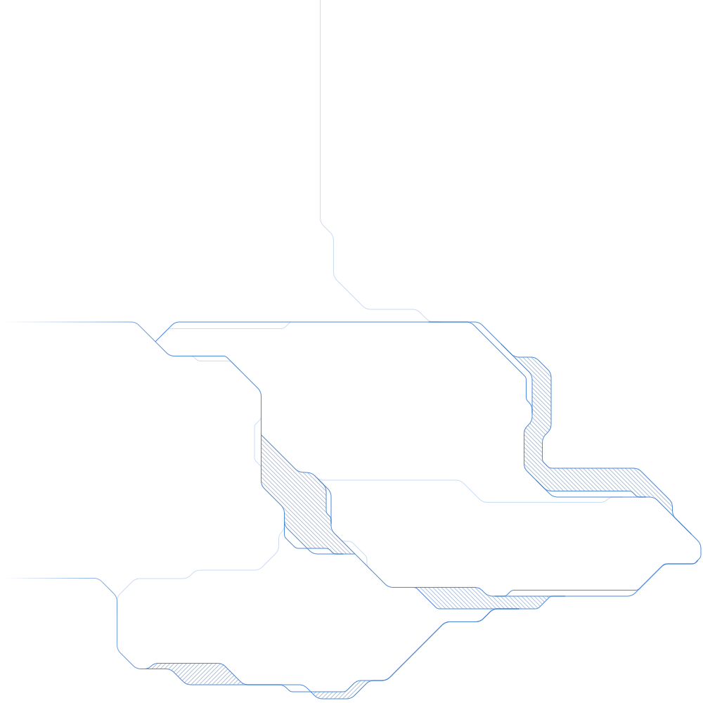
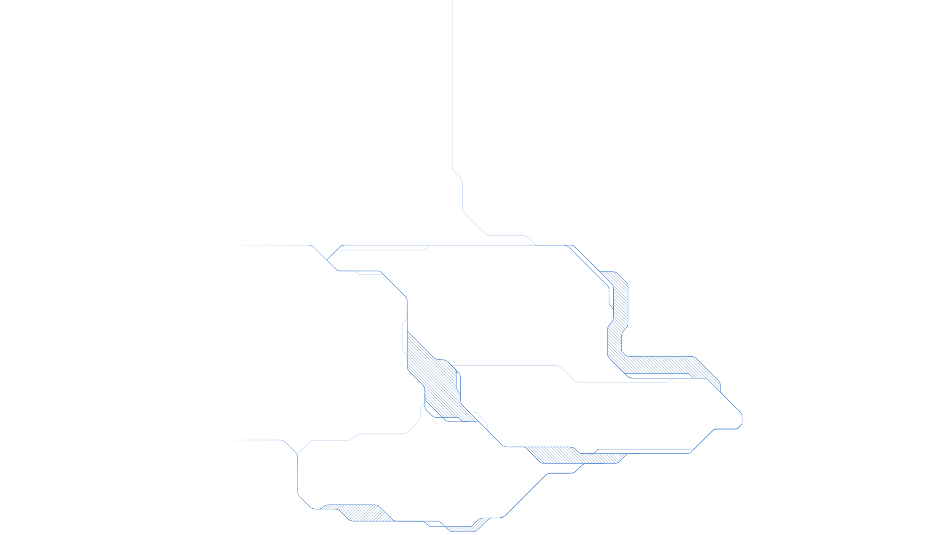
The motherboard pattern echoes the geometric language of the logo: strokes with 45-degree chamfered angles. It works as a discreet background, never as a main element.
Rules
- Maximum opacity: 10% in light theme, 14% in dark theme.
- At most one pattern per section.
- Never tile it.
- Never animate it.
- Never place it behind a paragraph.
What we never use
- Padlocks, shields, generic keys
- Hooded hackers, matrices, green code
- Fake cybersecurity interfaces
- Cliché stock imagery
- Generated faces
- Glassmorphism, glow, neon
- Gradients on text or buttons
- 3D effects
These elements are the opposite of what Ariovis says about its craft. Identity security is neither a vault nor an abstract threat: it is organizational work.